Some of the buildings we have been looking at for inspiration:
Centre Georges Pompidou
We found the fact that the Pompidou centre really contrasts with the rest of Paris really interesting. The fact that every piece of it is visible and colour coded is also intriguing- it really appears very high-tech and machine like. The fact that every piece is visible also links in to what we are thinking of possibly putting on our Waiheke site- perhaps a piece of exoskeleton architecture. High tech, yet still natural...
Peter Zumthor's Thermal Baths in Val, Switzerland respond to the natural landscape. It is constructed with local materials: Valser quartzite and concrete. It resembles a rock sticking into the hillside and concentrates on creating a charged atmosphere with water, light, heat and steam.
We looked at this mainly to get an idea of how natural materials can be used within a modern design.
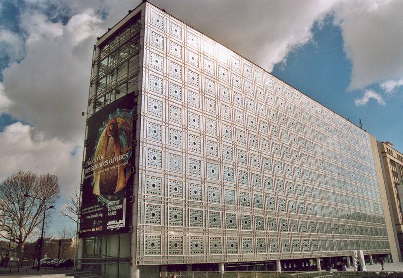
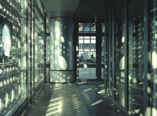
Jean Nouvel's Institute du monde Arabe plays with the ideas of what you can see and what is actually there, in a cultural context. The detailed façade allows people to see out, but not in. The rigid rectangular shape of the building contrasts with the curve of the river Seine. Interesting shadows are created by light filtered through mechanical shutters. "Not an Arab building, but an occidental one."
We were interested in many aspects of this building. It's cultural significance, how it was quite a modern building with historical and cultural references, how you can look out but not so much in etc... we will probably look at this in more detail later and use it quite heavily as a reference for the hotel on our city site.
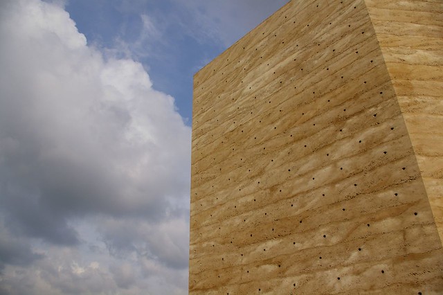
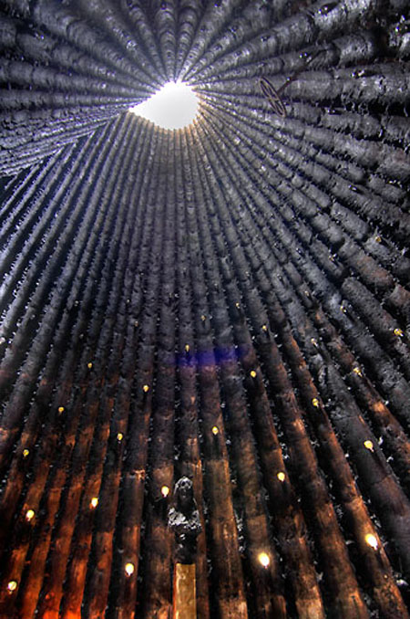
Peter Zumthor's Bruder Klaus Kapelle's rectangular prism shape stands out against the landscape- fields- on which it is placed. The mystical and thought provoking interior is not what one expects when they see the rigid exterior. Light is filtered through an oculus and tiny holes on the side of the building, giving a cosy, enclosed feeling. A technique called 'rammed concrete' was employed by Zumthor to create a texture similar to rammed earth. "A beautiful silence".
We were very interested with how the building appears like one thing on the outside (simple) but as something else on the inside (complicated). We also admired the way they got light to enter the building, with small holes punched into the walls and a large skylight, almost like an oculus, at the top.


No comments:
Post a Comment